A while ago I built a pen based on Ramotion's pull to refresh concept. It's a really cool concept and I wanted to see if I can make it work on the web. Seeing as many people liked the end result, I thought it would be interesting to provide a follow up post on how I tackled the challenge and hopefully provide someone with a better understanding of how it all works.
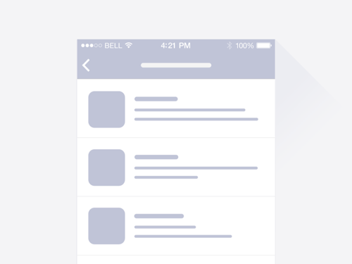 This is what we will be replicating
Preparing HTML
We need to think about the HTML structure of our code, the tricky part here is and trying to spot the layout challenges that may occur and set it so that we will only need to manipulate the transform values and avoid layout changes, this way we won't complicate our animation and keep improve it's performance.
I often see animations, which are hacky and have suboptimal performance due to bad HTML structure and developers compensating with JS code to hack their way through it - reordering elements and forcing unnecessary layout calculations, ultimately ending up with a bunch of confusing code. There's a cool site called CSSTriggers that shows which operations are triggered when updating or changing each CSS rule.
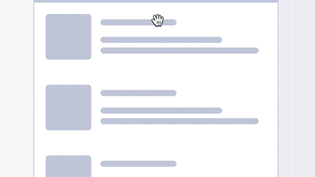
In our case, the structure before we start setting up the animation is just an SVG wrapper and a list inside a container. The SVG wrapper has a set z-index value because in the future steps we will need it to overlap our list and it will. We will also be applying the gooey filter to this wrapper since the gooey filter must be applied to a parent container!
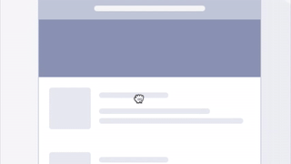
 now we only transformY the wrapper and
we are set to work on the animating part
The SVG path
Since we will need to animate the curve of our SVG path, the most appropriate choice is if we use a cubic bezier curve, draw it on the bottom edge of our SVG and animate it's Y position. Cubic bezier paths have two control points, but we can write our path with a shorthand version that allows specifying only one control point like so:
The other type of Bezier curve that is available is a quadratic Bezier, Q. It's actually a simpler curve than the cubic one: it requires one control point only, which determines the slope of the curve at both the start point and the end point. It takes two arguments: the control point and the end point of the curve.
Q x1 y1, x y (or q dx1 dy1, dx dy)
Start animating

This animation has 2 main stages:
- Pulling down without curving the line
- Pulling down curving the line only
So first off we need to detect the starting Y position of the drag, we do that by subscribing touchstart and mousedown event listener to our list. For desktop we can read the Y value with from the event.clientY property but for mobile we will have to read it from the event.originalEvent.touches[0].clientY property.
var START = event.clientY || event.originalEvent.touches[0].clientY
Next up we want to get the drag distance, so we subscribe for a mousemove event after the initial user interaction, access the Y value and deduct it from the start position. Now we have a difference that we can work with.
tip: don't forget to subscribe the mouseup event and touchend event so that we can prevent the block that handles dragging from executing after the drag releases
Pulling down and changing opacity
So, for our first step of the animation we can see that we change the transformY of our list and fade out the bottom part, so we chunk these two operations into two separate functions like so:
function translateSVG(distance) {
    // calc transform from distance:
    // distance - starting offset
    $('list').css({ transform: 'translate3d(0,' + transform + 'px,0)' });
}
function setOpacity(distance) {
    // get index of opacity from distance:
    // distance / total height
    $('.list').css({ opacity: index });
}
### Curving our line
In step 2 we can see that the curvines of our line changes depending on the dragged position. To animate the "curvines" of our cubic-bezier, __we have to animate the position of our cubic-bezier curve's control point__.
We can do so, by creating a function that changes the control point of our cubic bezier curve by taking the __distance__ as a parameter.
function setCurve(distance) {
  var friction = 1; // we can also add friction
      // by multiplying the distance with a number smaller than 1
  var frictionHeight = height * friction;
  var d = "M-10 90 Q 161 " + frictionHeight + " 332 90";
  $(CURVE).attr('d', d);
}
Now we can simply do:
if(distance < startCurvingHeight){
    // STEP 1
    translateSVG(distance);
    setOpacity(distance);
  } else if(distance > startCurvingHeight && distance < endDragHeight){
    // STEP 2
    setCurve(distance);
  }
 The result
Notice how after we pass some max drag distance, the height changes no more, this is the part where we need to __trigger__ our animation, so we can simply add an else statement to our dragging block and trigger the animation there.
The result
Notice how after we pass some max drag distance, the height changes no more, this is the part where we need to __trigger__ our animation, so we can simply add an else statement to our dragging block and trigger the animation there.
if(distance < startCurvingHeight){
   // STEP 1
   translateSVG(distance);
   setOpacity(distance);
 } else if(distance > startCurvingHeight && distance < endDragHeight){
   // STEP 2
   setCurve(distance);
 } __else{
   // START ANIMATION
   startAnimation();
 }__
The first few properties that we will be animating are the transformY and the "bouncy curve" e.g. our control point's Y position. Since transformY is simple, let's take a look at how we will do the curve animation. We know that our bottom edge appears linear if the bezier control point's Y value is 90 (start value) and we set our drag limit variable to 100, the control point's max Y value will be the sum of these to e.g. 90 + 100 = 190
So, how do we do the animation itself, since we can't animate curvines of an SVG line directly?
We animate a dummy value instead. Popular animating libraries such as Tweenmax, Velocity... expose a progress function which gives us access to the tweenValue parameter__, which in our case will be the height of the control point that we are animating and we can use our previously defined function for setting the curve to our current value.
$("#curve").velocity({
     tween: [90, 190] // __start__ and __end value__
   }, {
     duration: 700,
     loop: false,
     easing: [0, 3, .3, 0.4], // __bounce easing__
     progress: function(e, c, r, s, __tweenValue__) {
       // Create our curve with tweenValue
       // being the height animated from 190-90
       __setCurve(t);__
     }
   });
 something went wrong
Let's try and understand what happends. (I was stuck looking at this trying to understand it for ~10 minutes).
If we look closely, we can see that our curve animation is only visible on the lower side e.g. when the value of our control point is greater than 90 and our curve is concave.
The reason this happends is that our curve has a starting background color of purple, so when we animate it on the top e.g. the Y position is lower than 90 and our curve is convex it's purple on purple background**, thus invisible. But when the curve is concave it's purple on white background.
We need to to change the color of our curve and since we know that the mid value is 90 we need to change the background color of the curve depending on if the value is higher than 90 and lower than 90, e.g. our curve is concave or convex. We can do this by checking the current tweenValue exposed by the progress function and changing the fill attribute of our curve.
$("#curve").velocity({
     tween: [90, 190]
   }, {
     duration: 700,
     loop: false,
     easing: [0, 3, .3, 0.4],
     progress: function(e, c, r, s, tweenValue) {
        __if (tweenValue > 90) {
          // fill purple if it's more than 90
          $('#curve').attr('fill', '#8B90B1');
        } else {
          // fill white if it's less than 90
          $('#curve').attr('fill', 'white');
        }__
        setCurve(t);
      }
    });
 Voila, our bug is resolved!

I hope this provides a better understanding on how this animation is structured and gives you an insight on how to animate SVG curves.
Next time will go into detail on how to reverse the animation to the start position depending on it's current state and how to properly handle the attributing of our Gooey filter to achieve the desired merge effect.
The final version is on my Codepen profile, but there's also one that Nikolay Talanov did, so be sure to check out both of our approaches.
Thanks for reading, till next time :)!